FernanDough Bakes Case Study
Streamlining order and checkout process to enhance customer experience
Project Specifications
My Role: UI & UX Design
Client: FernanDough Bakes @fernan.doughs
Timeline: 4 Weeks
Tools: Figma, Google Docs, Google Forms, Zoom
Problem Statement
FernanDough is an Instagram based local business; their reach is limited to user who regularly keep up with Instagram. Currently, customers must to go through multiple apps (Instagram, Google Forms, Zelle/Venmo) to complete their order.
Background
Having their own website will streamline the entire ordering process for the user as well as widen their reach beyond their current Instagram audience. A website will decrease the chances of the user making unnecessary errors, missing a step, or experiencing frustration while jumping from one app to another. Having every part of the process in one platform will expedite and enhance the user experience.
Research
Direct Competitive Analysis
Out of the four websites I analyzed, two of them (Kora & Bang Cookies) had a similar business structure to FernanDough. They offered orders based on current availability and they also had local delivery and pick-up’s. So I paid close attention on how their design facilitated this process for the user.
Indirect Competitive Analysis
For the indirect competitors I analyzed 2 businesses that focus on delivering healthy meal-prep style, ready to eat meals to customers. Although, their serve different products from FernanDough, they still shared similar structures. I analyzed layouts and flows that were vital in the browsing, ordering, and payment process.
Key Observations
product images that clearly showcase each item
mouth watering, tempting images to entice the user
exciting product descriptions
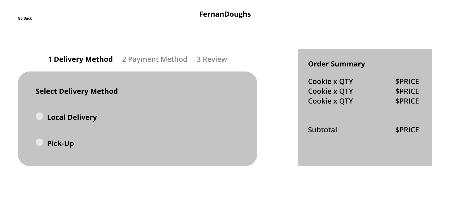
clear process for selecting delivery or pick up method to avoid confusion
ease of browsing and undoing or changing actions the user made
User Interview Summary
The responses I’ve collected helped me gain a better insight on how to best replicate the sensorial experience when purchasing desserts in stores and gave me a better understanding of any frustrations the users have experienced in the past when purchasing desserts.
Main Insights
💡The dessert shopping experience is powered by the senses (seeing products displayed, smelling freshly baked goods, tasting a sample), so it’s important for the design to best replicate this for the user’s online experience through images, descriptions, and reviews.
💡A common frustration with in person shopping are long waits. Users value their time so having every step of the ordering process in one platform will be more time efficient, enhancing the user experience.
Empathize
User Persona
Storyboard
Empathy Map
Design
Key Screens
Browse the latest menu
Shop your favorite flavors
Send payment and place your order, all in one place!
Final Prototype
Testing
Objectives
📝 user will pick desired cookie flavor, pick quantity, add it to cart, and successfully check out and place order
📝 user will browse the website and navigate back and forth between screens with ease
📝 identify successes user experienced as well as any frustrations
Results Summary
⭐ 6/6 users were successful in finding desired cookie, selecting a quantity, adding it to cart, and proceeding with checkout until the confirmation page was reached
⭐ 6/6 users attributed the positive experience to the easy and clear navigation
Affinity Map
Feedback Highlights
“I like how the quantity (half, one, two dozens) were available right there and I didn’t have to go to another page to select and add it to my cart”
“It’s quick and easy to find what you’re looking for”
“I love the reviews, our story, and FAQ pages!”
Next Steps
📝 As FernanDough’s business grows, different design needs may arise or require iterations. For example, when they roll out new flavors of crinkle cookies the layout of the cards may need to be adjusted.
📝 Recruit more users to conduct usability testing and get a wider range of feedback.
Reflection
So happy to have completed my first UX capstone (Yay!) 🎉. I’m so grateful to have experienced the UX Design process from beginning to end with FernanDough. Here’s a list of a few things I learned.
Always ask for feedback. It’s easy to be conditioned into seeing and solving problems from my own eyes but so many more possibilities open up when you look at things from other people’s perspectives.
Utilize components better. Know when and where to use them. A huge chunk of my time was definitely concentrated on wireframing and prototyping. However, my timeline was definitely set back when I had to make iterations which definitely could have been a quicker process had I used components more to my advantage.
Features are only helpful if necessary. During the sketching phase, I wanted to include a graphic within the product cards that indicates if an item is available for local delivery, pick up, or both. Since the menu is very small and limited as of now and that every flavor is available for both delivery methods, this feature would not have been necessary. It might just lead to further confusion for the user and could simply just clutter the product card.


