Mirror Case Study
Expanding the reach and accessibility of a brick and mortar business through an online platform.
Project Specifications
My Role: UI & UX Design
Timeline: 8 Weeks
Tools: Figma, Google Docs, Zoom
Problem Statement
Mirror has solidified their name in the fashion industry through their storefronts across the country. However, they lacked an online store.
Background
With the increased prevalence of remote working and learning, people are connected online more than ever. An online store will give customers access to discovering and purchasing products without the need of going to a store. Establishing an online presence will also allow new customers to discover Mirror and be able to easily share it to others online.
Research
Competitive Analysis
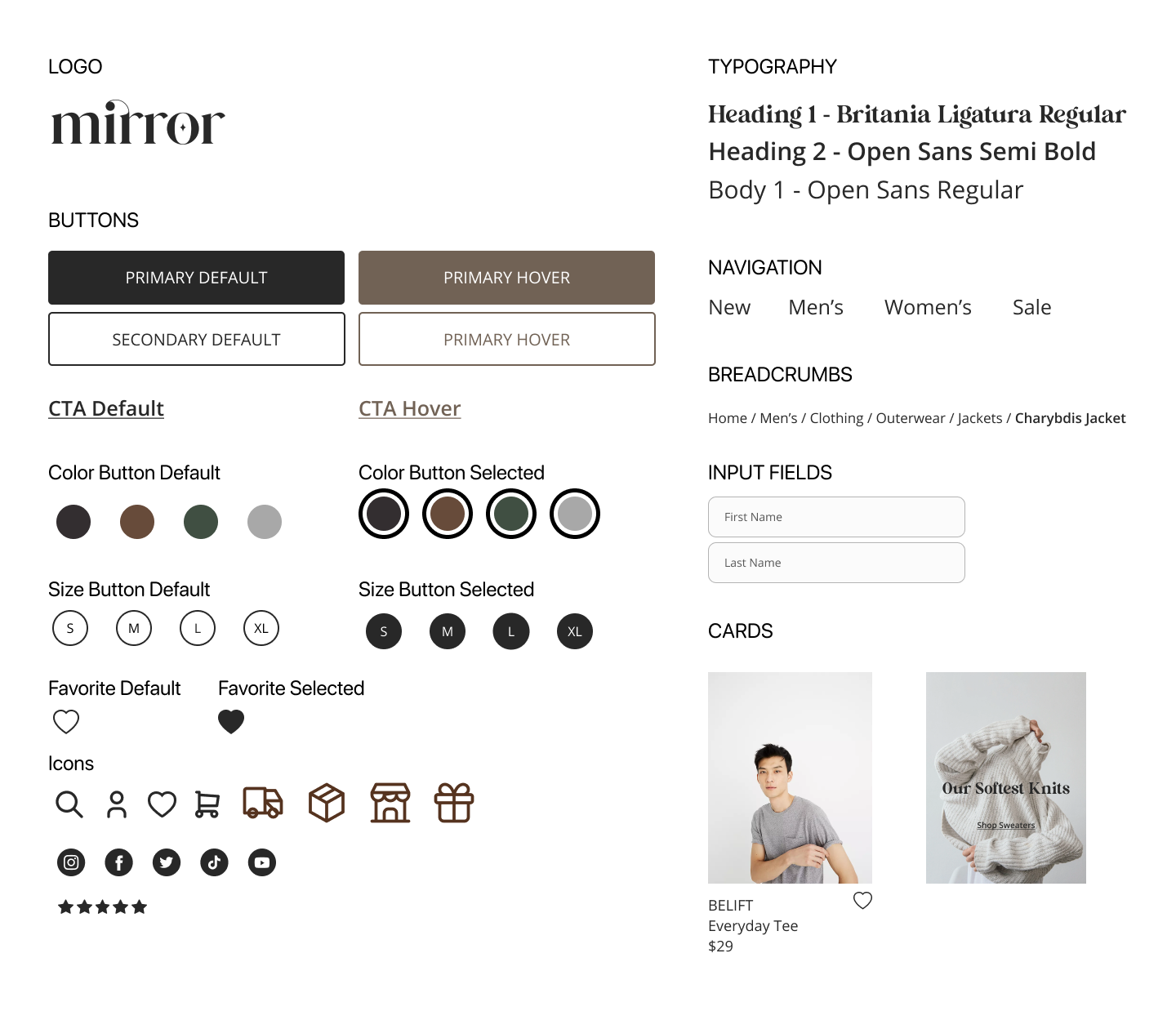
I analyzed the strengths and weakness of direct competitors such as Artizia, ASOS, and Princess Polly as well as indirect competitors such as Chamberlain Coffee and Starface. I paid attention to their layouts, graphics, design elements, as well as the tone they used throughout their websites to cater to their target demographics.
User Interviews
I gathered 3 participants who were females between the ages of 19 to 25. They also had varying preferences on online shopping. Through a series of interviews I was able to identify their motivation to online shop, as well as any bias, successes, and frustrations they experience. View Full Interview Transcript
Empathize
Persona
Storyboard
Empathy Map
Design
Final Prototype
Testing
Usability Testing Objectives
test ease of navigation and user flows
determine if user can independently and successfully find and item, add item to cart, proceed to checkout
observe user interaction with prototype
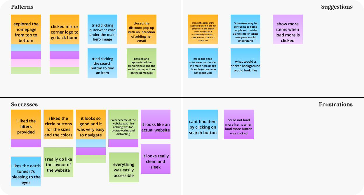
identifying any frustrations as well as successes
Usability Testing Results
100% Completion rate
5/5 participants found successfully found the jacket and checked out
5/5 participants appreciated the easy navigation, clean design, and aesthetically pleasing visuals.
Affinity Map
Next Steps
Make design and content adjustments based on feedback
Include unavailable options, features, graphics, information, etc. from first iteration
Create additional screens
Prototype new task flows based on user’s needs and feedback
Conduct more usability testing as new prototypes are available to get more user feedback
Key Takeaways
It’s been a great experience working on Mirror from beginning to end and seeing it come to life. If I had to continue my work on Mirror I would definitely recruit more participants to conduct interviews and usability testing with. I was able to create and iterate my designs based on the user feedback I got, however, more perspectives would definitely help me cater to the user’s needs better. A struggle I encountered was definitely gathering cohesive images for the website and creating texts myself. Since I was not provided with images and texts, I had to set aside a good chunk of time to obtain those key elements. However, It was a good exercise to test my creativity with creating catchy lines and product names for the website and collecting various images that pieced together to reflect Mirror’s unique color as a brand.


